


 4 minutes
The icon of your hyper-casual games in the app shop is the starting point that makes the first impression on users. The icon is the structural part that can make your game stand out among thousands of others, as well as attract the attention of the customers themselves. 5 tips on how to create and test the perfect icon for your hyper-casual games were shared by Lolita Snopkova, director of creative operations at Supersonic.
1. High contrast level is a key to attracting users’ attention
Maintaining the contrast level is very important, as it is the parameter responsible for the concentration of attention among users, as well as helping them at a glance to assess and define the concept of your hyper-casual games. It’s worth putting yourself in the shoes of the average user to understand this: We always run past dull and obscure icons, preferring those with high brightness levels, colour saturation, where every element is highlighted.
For example, an earlier version of the icons for Arm Simulator used dark tones of red, brown and yellow. However, the new icon, which highlighted blue tones, was able to increase CVR by 3% without changing the concept.
2. Update your icon
An effective game icon demonstrates your core concept, which means it should relate specifically to your game. Simply put, you should demonstrate the game mechanics, this would be the easiest option for success.
A great example of applying such a concept is Emoji Puzzle. In the early days, the icon was a laughing emoji that didn’t provide any insight into the gameplay component at all. However, by working out a new variant, where the gameplay mechanics are depicted in a minimalistic way, the developers achieved a 30% increase in CVR!

3. Make hyper-casual game icons simple
The fewer elements your icon depicts, the easier it will be for users to navigate through the game. An icon does not help to fully reveal the gameplay or other components of the game, but you should use the screenshots and videos attached to the game description for this purpose. Highlight what’s most important – it’s what will draw users to your game.
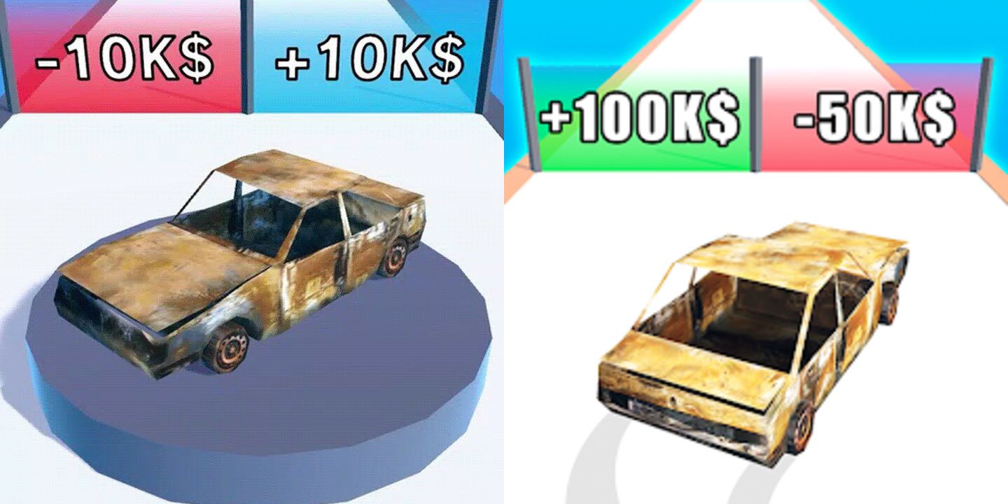
For example, one variant of the icon for Get the Supercar featured the car in a circle and used hard-to-read multipliers. Another version showed the same car moving towards a clearly marked, contrasting gate. This version looked like actual gameplay, with elements clearly visible and taking up the whole screen, resulting in a 22% increase in CVR.
4. Be inspired by the art and work of others
A great source of inspiration for developing an icon is the most effective creatives. Look at what works in all campaigns and then try out that winning concept or theme in your icon.
A side note: Azur Games tips for creating hyper-casual creatives
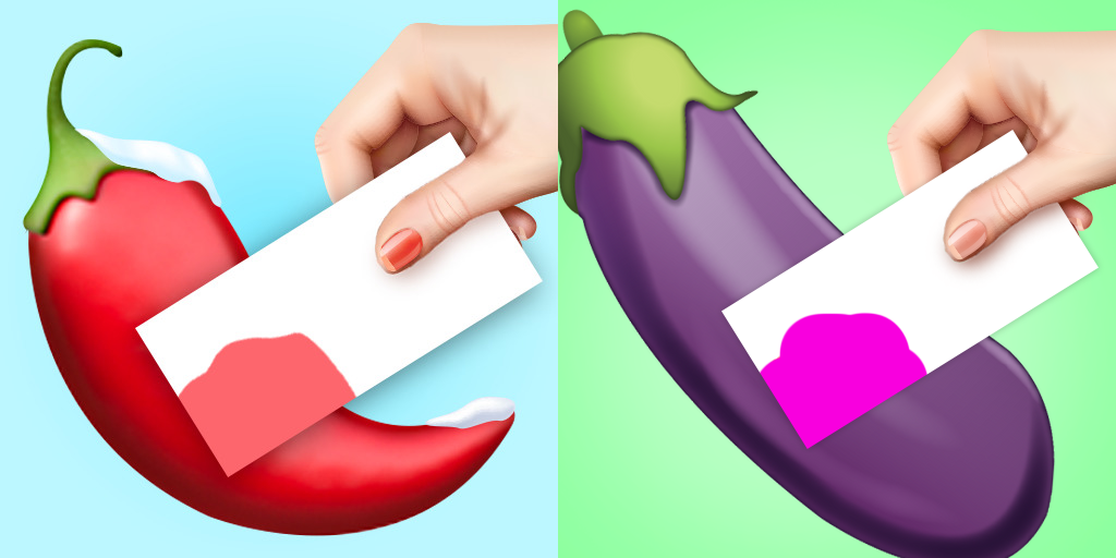
String Art, for example, uses realistic images and art in the game itself. That said, the previous icon simply showed a spool of thread that players use during gameplay. However, a performance analysis showed that the best creative featured a cartoonish style and a recognisable emoji – an aubergine. By applying this to the icon, it was possible to create a more successful icon with an 8% increase in CVR.

5. Try different styles for hyper-casual icons
Different users tend to be attracted to different stylistic features in the game icon. It is therefore worth testing different ideas in order to find the most successful and effective version of the game icon.
The most popular styles are:
- Cartoonish
- Emoji-looking
- Realistic
- Sketched
For example, for Color Match, the developers depicted the aubergine on the icon in several different ways to find the version that performed best. Each of them had a different CVR, which proves the need to test each option.
Something else to be aware of when creating hyper-casual game icons
Keep testing different icons to optimise the CVR and avoid dropping relevance figures. It’s also a great way to update an older game and encourage player retention rates. For users who have already installed your game, a new icon on the home screen can encourage them to go to it and re-enter the game.
In fact, absolutely any small detail in your icon can affect your CVR. You won’t know which element or which combination of elements makes the most difference until you’ve tested all the possibilities. Even an unexpected detail can make a difference. Test your icons and maybe one of them will be your key to success.

1,234


 1 minute